Gotta Grid’em All!
How to improve chart clarity by considering your plot background
When building charts data visualizers often focus on colors, shapes, and element aesthetics. We rarely think much about the background, especially the gridlines where all our data lives.
Slightly changing the plot background can bring more context and improve the comprehensibility of your graphics.
A tiny change can add context
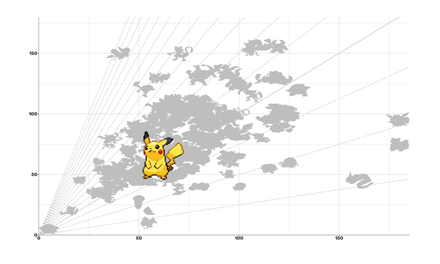
To illustrate this point, I visualized a Pokemon dataset containing information about each creature, including attack and defense statistics.
This classic grid doesn’t provide much information. You can differentiate data points from each other, but that’s all it offers.
Now consider the same plot with added gridlines arranged to highlight the sum of attack and defense statistics.
It was already quite easy to see that Pokemon on the top right are the strongest. Adding these dashed parallel lines on the second chart creates groups of characters within different levels of aggregation.
For instance, I added up attack and defense statistics to quickly differentiate overall Pokemon power. Pokemon aficionados often see Mewtwo as one of the strongest creatures, but not Cloyster, though it has better attack/defense mix overall.
Furthermore, you can play with the line distribution. In the example, lines are percentiles of attack and defense sum. You could choose regular intervals or another “clustering” metric, too. In other words, gridlines allow you to refine outlier analysis and help readers draw useful comparisons.
Highlight ratio for better differentiation
Another option is to consider the axis ratio.


