


Issue 3 - Great things scale
Talking with the computer

When it comes to society issues, I often think about scalability opportunities.
Pandemic: we get stuck to scale up and down our healthcare resources. Still get vaccines in under a year.
School for everyone worldwide is hard: provide courses through the Internet1.
Don’t have a connection? Send some satellite in low-orbit to offer cheap connection everywhere.
More capitalist: cabs are expensive and not very easy to book. Uber. Music is expensive and requires physical space. Spotify.
The world's best inventions are by-products of “scale-up” opportunities.
Vicki Boykis wrote a great blog post on how “good things don’t scale” (I urge you to subscribe to her newsletter).
I think great things scale in the long term.
Reading Enlightenment Now by Steven Pinker, you can feel how humans used to succeed at building things and societies that scale. In the long term.

Behind scalability is the concept of leveraging value from early small assets.
Nothing’s magic. To build something that repeatedly delivers value, you can’t escape the responsibility of good, methodical science.
We often fall toward quick solutions. But keeping in mind the value brought by scalable design over time is a key to drive our decisions.
As a former colleague of mine once said:
“The quick win solution of one is not that of the other.”
Expected Contents
Web page prototype made easy
Front-end developer is a job, but you sometimes need a quick prototype to show your work or explore some web libraries. A well-known framework is Bootstrap, but it's sometimes too much for a demo.
MVP.css is a lightweight stylesheet for HTML elements.
It's only 8kb. One liner tag import. Mobile friendly.
Perfect for an MVP.
R vs Python. Why not both?
This is a long debate in the data science community. Some prefer Python, some prefer R, but we are few loving both of them.
Personally, I mostly use Python for the engineering parts of my work, and some very quick notebook analysis. I prefer R for data-wrangling and more serious analytics thanks to the amazing tidyverse library, especially ggplot2 for data visualization.
Early this year, Michael Chow presented Siuba at the RStudio Conference. His Python library enables to leverage the power of dplyr syntax, offers options to generate SQL code and it fits with the ggplot2 Python parallel, plotnine.
Definitely give it a try!
Is your company too dumb to be data-driven?
If you work within a data team, you probably faced problems with businesses or product teams. Being data-driven is about business users learning to ask good questions. Something very hard to do.
Even within data teams, it takes time to find a good standing point to pull out the best of the data.
This article resumes perfectly how companies can evolve toward data-driven decisions.
In a nutshell: it's neither about the business domain, tools, or organization shape but about transforming the behavior and skills of people. As always.
What's SRE?
I always feel DevOps guys are the real wizards. They often know better how to design good software, deal with legacy, find the good tool for the corresponding problem, etc... Maybe because these are more "senior" roles and so filled by experimented craftsmen.
But it's also a mindset. Not present enough in data-science in my opinion.
"SRE is what you get when you treat operations as if it’s a software problem. Our mission is to protect, provide for, and progress the software and systems"
While DevOps is more about a mindset, Site Reliability Engineers’ position turns it into concrete things. They are developers who naturally try to fill the gap between development teams and operations teams.
Are site reliability engineers the next data scientist?
Bonus: I didn’t know about Service Level Objective quite recently… if you’re in the same position check out this blog post from an SRE at Google.
Company Handbook
Gitlab shares to the world its team handbook.
It's a gold mine: from communication or engineering assets to CEO notes, all are worth the read.
Printed, it consists of over 10,400 pages of text.
Some geek memes
Easy content, but feel like summer is not that far... Relax and take a drink!

The Blog Post
Terminal is still the best computer interface.
Beyond The Bracket
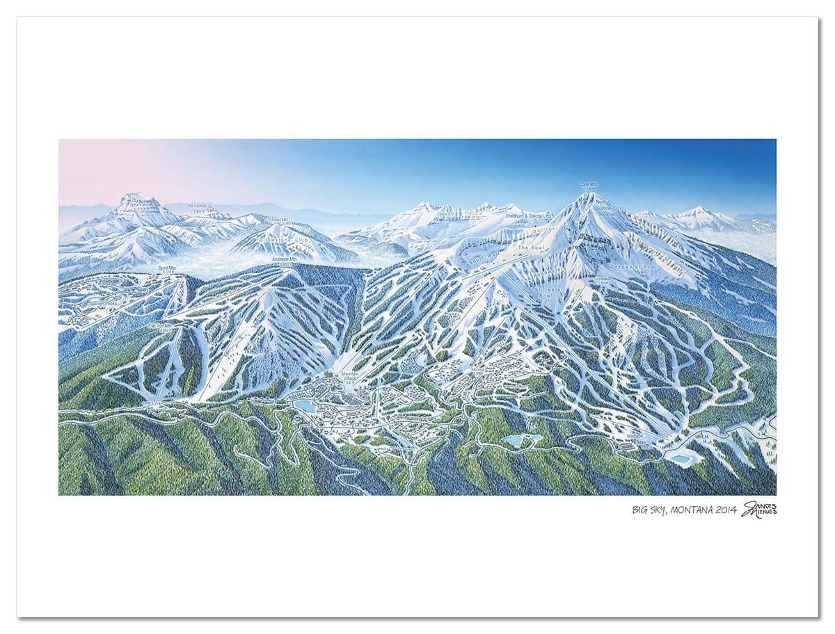
Loving maps, skiing, and arts, I have this little pleasure to get a lot of ski resort maps when going on mountain vacation during winter.
Could not get one in my hands this year, but James Niehues works allow me to comfort myself.
This artist draws incredibly accurate ski resort maps with a nostalgic wash of pastel color that’s instantly recognizable.
There is something special about such crafted work.
It takes time to master something. We often look to quick results but we're used to forget the offset between our daily life and the way our brain digests information.
Making the parallel with engineering work and code, those pictures remember me how planning things and taking attention to details are keys to develop rich projects.

I save a lot of quotes or ideas from books, blog posts, tweets, etc… I call this space “peripheral brain” because they are often notes that I can’t remember too much.
Love to read them again from time to time, here is one :
“Your future self is watching you right now through your memories.”2
It seems Lambda Course is one of the newcomers….
This is sometimes a bit cheesy, yes…