


Issue 14 - On using emojis everywhere
Starting the conference game


I don’t know about you but... I’m using emojis constantly.
In my messages, in my slide decks, in my emails, in my documentation.
Though it was not natural at first, it’s now something inked in my digital writing.
Those little pictures consist mostly of nouns. They don’t have set meaning, grammar, or syntax.
We are giving them semantics as we go. Sometimes at a macro scale1.
Still, emojis don’t replace language.
They provide nonverbal cues. Fit-for-purpose in our digital textspeak. Helping us to nuance and complement what we mean by our words.
Closing some gap between the digital and the physical.
By writing, I’m sharing a certain mental model of mine with yours.
Those little pictographs help me in some way to this goal.
So I feel I will continue to use those ones pretty much everywhere I can 🙃2.
📡 Expected Contents
Random Forest explained
It’s one of the most used machine learning algorithms out there.
Here is a great post explaining how Random Forest model works. It’s full of great graphics and animations.

On the importance of annotations in charts
We often learn that graphics have to be sharp. To contain only necessary information.
However, top-notch charts often include elements of context.
Annotations, composite legends, color highlighting.
The recent post on Bloomberg “How the World’s Richest People Are Driving Global Warming” features some great charts and especially the one below:

At first sight, it’s looking confusing. Your eyes probably look first at the curve, but your brain doesn’t find so many insights. It’s after when you read those annotations that the magic happens.
This graphic is awesome! Beyond the actual numbers, it helps the reader to think deeper about the actual causes of those drops and rises according to capita...
It provides depth with only one simple curve and some annotations.
AB test software
Since I’m working3 I always heard concerns about AB testing systems. I never met any company having a smooth method to do AB testing properly.
It’s either in-house projects or coming from a third party. Still, never a high-grade solution.
Recently I discovered Growthbook. It’s an open-source tool for feature flagging and AB testing.
After some demos and exploration, it seems like a great product. With a lot of things out of the box.
Looking forward to further development.
+ There are backed by top venture capital funds, including Y Combinator. A good authority argument. I guess.

Russia’s war in Ukraine mapped
Though we all would like to see those beautiful maps for other reasons, it’s really interesting to follow those terrible events through great data journalism.
There are a lot of maps over there, some teams even refine their work regularly. Different cartographies can significantly change how one understands events.
The Financial Time released a terrific work. They mapped war events featuring videos and graphic elements all in one visual story.
It makes the whole history pretty clear and really engaging for the reader.

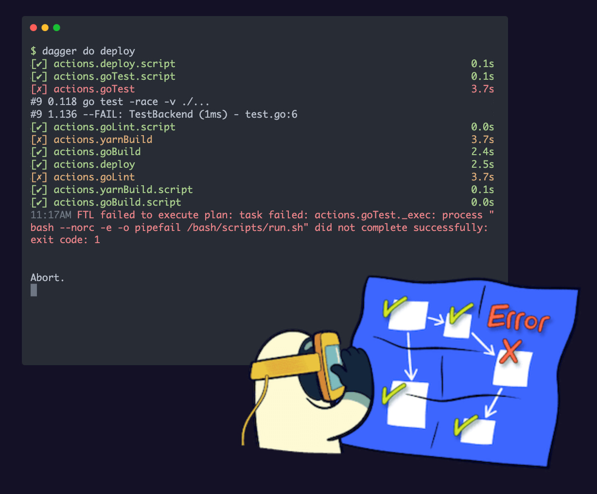
CI/CD, locally
Continuous integration and deployment is something more and more natural in any data stack. Still, it’s always running on top of a third-party service like GitHub Action or Jenkins. So somewhere-else. Not on your machine. Also, you need to rewrite your scripts when you change your CI tools...
Dagger comes with the premise to disrupt all of this. Developed by the creators of Docker and supported by CUE a template language from Google, Dagger seems to provide a better experience for CI/CD pipeline development.
Better than my words
Dagger is a portable devkit for CI/CD pipelines. It allows devops engineers to build powerful CI/CD pipelines quickly, then run them anywhere. Benefits include: unifying dev and CI environments; testing and debugging pipelines locally; and avoiding CI lock-in. Most importantly, it introduces an ecosystem of truly composable software components: a “lego system” which we hope will help the devops community solve its fragmentation problem. Under the hood, Dagger is powered by two of the most exciting technologies in the cloud-native ecosystem: Buildkit and CUE
I tried it out quickly last week. It’s 😍.
📰 The Blog Post
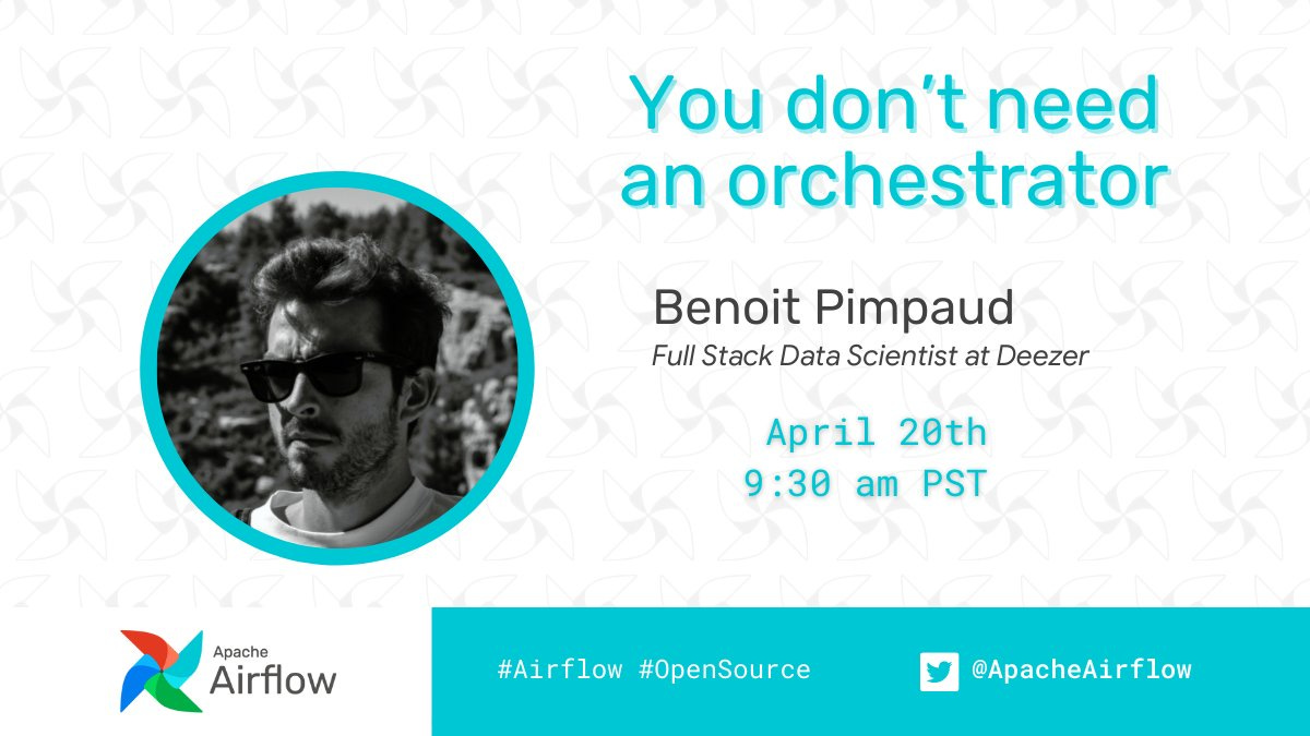
This month I use my blog post writing time for another purpose: to work on conferences and meetups 🎉.
Firstly, I participated in an Apache Airflow Community Meetup. Speaking about the need (or not) for data orchestration tools.
Then I got the chance to show my views on data science and engineering for a Breton university. Great talks with Yann Lecun’s former thesis professor and some CDOs.
I’m very happy with all of these, as it was my first time as a speaker at conferences. I like the exercise so I hope I will get similar opportunities soon!
🎨 Beyond The Bracket
I always come back to this iconographic encyclopedia.
Nicholas Rougeux, the guy behind this wonderful work, created this enhanced digital edition of J. G. Heck’s collection of illustrations from 1851 including more than 13,000 illustrations from 500 engraved steel plates and more than 1.6 million words of descriptions.


What’s really interesting in this web version is the interaction.
Descriptions are enhanced with small images you can click to look full-screen.
Things are easy to retrieve. Easy to read.
Nicholas also did similar things with its British & Exotic Mineralogy and Illustrations of the Natural Orders of Plants.
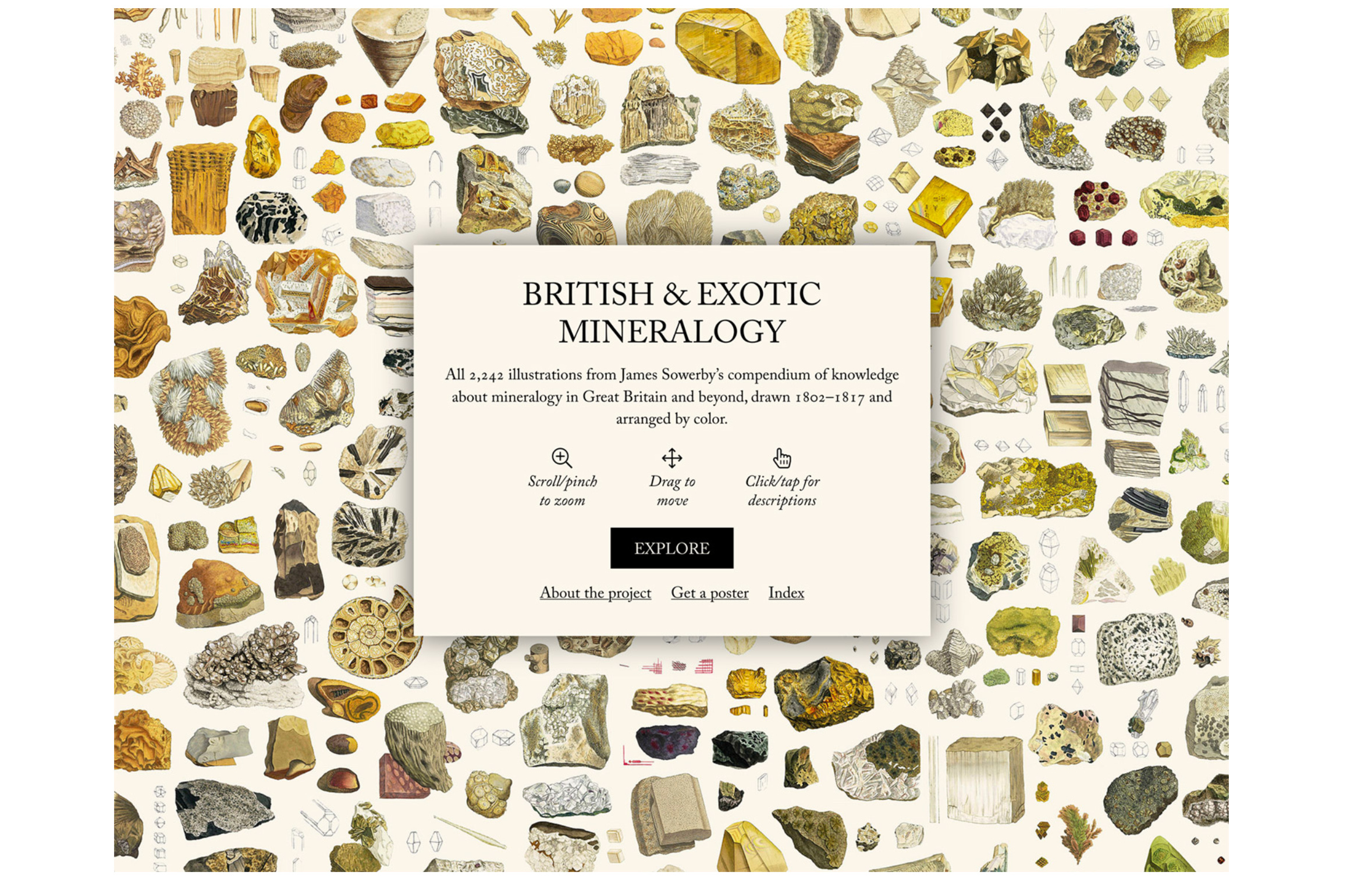
It’s definitely huge and awesome work.
A reminder that documentation is not a side thing.
Should we have dedicated job positions for this 🤔?
Maybe. Like a librarian working close to engineering teams. Keeping things clean and stable.
Beyond work, I really encourage anyone to develop a personal peripheral brain.
Somewhere you can go back and forth to find ideas, find useful tricks, thoughtful citations, etc...
A self-encyclopedia.

April was kind of though. Some trips and awesome landscapes, great music discoveries, brilliant meetings, some significant projects closing, some good and sad news.
I feel both thriving and ambitious. Seeking more wisdom and pace. Looking forward to the next month
This newsletter welcomes a lot of newcomers. I hope you will find what you were looking for when subscribing 😊.
Again if you have any questions or observations: hit reply. It’s free and quick. Assured answer 🤝
See you next month!
🐐 becomes a stand-in for the acronym GOAT (“greatest of all time”)
4 years now...